Software Developer (iOS, Java, Rails), Father of 5, basketball junkie, Celtics fan
15 stories
·
3 followers

eBay Is Delisting Dr. Seuss Books Taken Out of Print This Week

2 Comments

Jeffrey A. Trachtenberg, reporting for The Wall Street Journal:

Online marketplace eBay Inc. said it is working to prevent the resale of six Dr. Seuss books that were pulled earlier this week by the company in charge of the late author’s works because they contain offensive imagery.

“EBay is currently sweeping our marketplace to remove these items,” a spokeswoman for the company said in an email. New copies of the six books were no longer for sale online at major retailers such as Barnes & Noble on Thursday afternoon, which put eBay among the most prominent platforms for the books to be sold.

Harry McCracken:

Ending publication of these books is a reasonable move, but I’m not sure about eBay’s logic here, other than avoiding bad PR. Unless it now wants to police its site and remove every old item containing offensive stereotypes, which would be a LOT of stuff.

(BTW, I would also have been fine with Dr. Seuss Enterprises revising these books to remove the stereotypes. They’ve already tampered with the Dr.’s legacy in a zillion ways that bother me a lot more.)

I agree with McCracken on both points. I mean, you can buy copies of Mein Kampf but not If I Ran the Zoo? Banning books is always a sign of out-of-control zealotry.

Read the whole story
rwarner
1138 days ago
reply
Agreed -- this steps too far. Overreaches like this spark backlash that blocks positive change.
iPhone: 30.163819,-81.571257
Share this story
Delete

Let’s talk about phone numbers on mobile sites

1 Comment

We need to have a talk about phone numbers on our mobile sites. This is such a small change, but when left out, it causes a major inconvenience for your users.

I’m talking about when phone numbers on a website aren’t tapable. Often the HTML is so that mobile operating systems cannot select the phone number alone and you are forced to remember/recite or write down the actual number.

So, when you put a phone number on a website, don’t just use any old element, use a link with the tel protocol.

So, you links look like this:

<a href="tel:+14168342343">416-834-2343</a>

You can put whatever you want inside the link – just like normal links!

<a href="tel:+14168342343">Call me Maybe? <img src="hehe.gif"></a>

This is better for your users, better for business owners and better for the site’s SEO. Win-win-win.

That’s all, please help me in spreading this best practice by sharing this article.

Read the whole story
rwarner
3499 days ago
reply
The animated gif made me laugh--I've been there!
iPhone: 30.163819,-81.571257
Share this story
Delete

End of an Era

3 Comments

Development of Robin has officially stopped. It has been a very interesting 2 years but the time has come to finally put a pin in the development.

The decision wasnt an easy one, and I would love nothing more than to see app.net succeed and my app get be finished and used by thousands of people, but the sheer stress and economic burden that the app had put on me as a lone developer was far too much for me to handle and was seriously affecting my mental health, which was one of the major factors in the ending of development.

Unfortunately, what most people don't realise, is that developing an app is not easy as it seems. It takes hundreds, if not thousands of man hours and dollars to make an app and get it into a decent state for release. While many people scorn at developers for charging a buck or two for their app, the actual turn over for a developer would put off aspiring developers in to making apps for a living.

Just to give you a quick insight into what I put into Robin over the past 2 years.

. 4130 code commits (an app I make in my day job averages about ~1130 commits)

. Along side working full time at a digital agency, I was working evenings and weekends on Robin, putting off more important things like family

. Although the DIP helped immensely and I have forever greatful that such a programme existed, sales alone do not cover server costs for the push notification system.

I really do hope that app.net finds its feet again and becomes the social platform it should have been from the start, but untill then, I can't afford to put any more development time into Robin. The code will still exist if that day does ever come and I will certainly re-ignite the project.

The push notification server will stay running until at least the end of the year, after which will likely be turned off (note that these costs will be coming out of my own pocket).

The code will not be open sourced, so please don't ask (this is not by choice)

I'd like to thank every who did support me, you guys were awesome.

Read the whole story
rwarner
3552 days ago
reply
"While many people scorn at developers for charging a buck or two for their app, the actual turn over for a developer would put off aspiring developers in to making apps for a living."

Sad, but understandable.
iPhone: 30.163819,-81.571257
Share this story
Delete
2 public comments
LonelyBob
3542 days ago
reply
Real life indiedev
Saitama, Japan
sfringer
3553 days ago
reply
What a sad day. Completely understandable. Best of luck to Callum!
North Carolina USA

The real problem with… well, everything

1 Comment

Rian van der Merwe on Facebook’s newly announced intention to ignore the Do Not Track setting in web browsers:

I’m becoming increasingly uncomfortable with how online data collection is driving product decisions. If a product’s sole source of revenue is advertising, then the design is going to reflect that. The product is going to be optimized for data collection so that it can provide better accuracy for advertisers. And if a product’s direction is driven by anything other than user needs, that product becomes worse for end users. That is inevitable. Nothing you can do about it.

This is why the “Well, what’s wrong with better ads?” argument doesn’t hold water. It’s not that I want to see less relevant ads (or no ads at all). It’s that I don’t want a company’s design decisions to be driven by a need to get as much data out of people as possible (as apposed to how to meet their core needs better).

I couldn’t help but notice similarities between this argument and the one I use to explain why I don’t like games that have consumable in-app purchases. It’s not the cost that’s the problem — I’m happy to pay as much as $50 or $60 up front for a great game — rather, it’s the way game design is influenced by the need to incentivize spending money. “This slot machine has some really compelling gameplay,” said no one ever.

Products, like anything else that takes part in an ecosystem, evolve to optimize whatever sustains them, and over time they shed the remainder like dead skin. Websites that rely on pageviews to survive become linkbait crapfarms. Ad-supported social networks sell off your attention in the precise quantity you’ll tolerate — until you get used to that, and then they sell off a little more. And games become shallow, joyless chores in fun’s clothing, because there’s a 0.15% chance you’re a “whale.”

If you’re working on a tech product right now, here’s what I propose. Before you type another line of code or click another pixel, stop and think: What do I want this to become? Now, is that vision the basis of your business model? Not something that exists alongside it, or despite it, or in carefully balanced tension with it, but the basis of it? If it isn’t, then you’re building the wrong thing.

Read the whole story
rwarner
3595 days ago
reply
"Products, like anything else that takes part in an ecosystem, evolve to optimize whatever sustains them, and over time they shed the remainder like dead skin."

I increasingly shun free tools, because either they're going to die or their creators are selling me out.
iPhone: 30.163819,-81.571257
Share this story
Delete

Font Points and the Web

1 Comment

When sizing fonts with CSS, there’s a rule of thumb that states:

1em = 12pt = 16px = 100%

There are even handy tools that help you calculate sizes based on this rule.

But this rule of thumb leaves out a very important piece of information. And without that information, you could be left wondering why the size of your type doesn’t look right.

Testing Points and Ems

To illustrate, let’s take a look at some work I’ve been doing recently to measure text accurately on the web. I have a simple test page that displays text in a single font at various sizes:

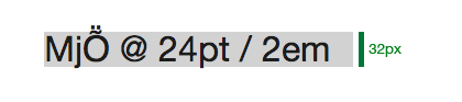
<!DOCTYPE html> <html lang="en"> <head> <meta charset="utf-8" /> <title>Em Test</title> <meta name="generator" content="BBEdit 10.5" /> <style> body { font-family: "Helvetica Neue", sans-serif; font-size: 100%; line-height: 1; } p { padding: 0; margin: 16px 0 16px 0; } </style> </head> <body> <p style="font-size: 2em; background-color: #eee;">MjṎ @ 24pt / 2em</p> </body> </html>

You can view a slightly more complex version of the page here.

The W3C recommends specifying fonts using either ems or pixels. Since high resolution displays are becoming ever more common, that really leaves you with just one choice: the em.

(Note: In the examples that follow, I’m using text set at 2em since it’s easier to see the problem I’m going to describe. The effect, however, will happen with any em setting.)

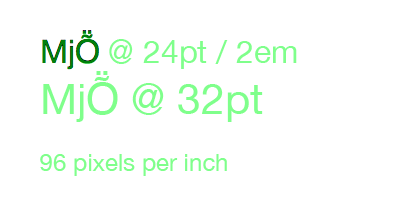
The body is set in Helvetica Neue at 100% so 1em will be the equivalent of 16px when the user’s browser is using a default zoom setting. The line-height is 1 so there’s no additional padding around the text: the default of “normal” would make the line approximately 20% taller.

When you display the test page, everything looks good because the sizes are all scaled correctly relative to each other. A quick check of the light gray background with xScope shows that the height of the paragraph element is 32 pixels (2 ems):

Browser

But then things got confusing.

Points aren’t Points

I had just been measuring some text in TextEdit and noticed something was amiss. Comparing the two “24 point” fonts looked like this:

TextEdit versus Browser

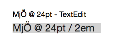
I’m no typography expert, but there’s something clearly wrong here: a 24pt font in TextEdit was noticeably smaller than the same size in my web browser.

I confirmed this behavior in three browsers running on my Mac: Safari/Chrome (rendering with WebKit) and Firefox (rendering with Gecko) displayed the larger version of 24 point text. Why were the sizes different?

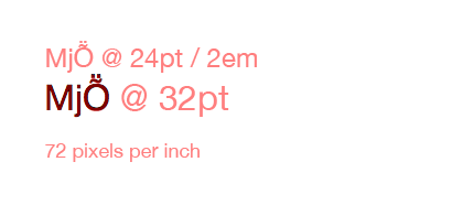
After some experimentation, it appeared that rendered glyphs were from a 32pt font:

72 DPI

What the hell?

A Brief History of Type

When confronted with a problem like this, it’s always a good idea to question your assumptions. Was I measuring the right thing? So I started learning more about type…

In general, points are meaningless. It’s a relic of the days of metal type where the size specified the height of the metal, not the mark it made on the page. Many people mistake the size of a glyph (shown below with red bars) with the size of a point (green bars):

Point versus Glyph

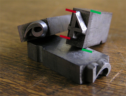
(Photo by Daniel Ullrich. Modifications by yours truly.)

Even things like the word “Em” got lost in translation when moving to the web: it originally referred to the width of a typeface at a given point size. This worked in the early days of printing because the metal castings for the letter “M” were square. Thankfully, we’re no longer working in the 16th century.

In modern fonts, like Helvetica Neue, a glyph for a capital “M” may be square, but the flexibility of digital type means that the width and height of a point rarely match.

Thanks Microsoft!

After doing this research, I was sure I was measuring the right thing. The sizes of the glyphs should match, regardless of point size. Something else was clearly in play here.

Let’s just say I spent a lot of quality time with Google before eventually stumbling across a hint on Microsoft’s developer site. The document talks about using a default setting of 96 DPI. I’ve been spending a lot of time lately with the Mac’s text system, so I knew that TextEdit was using 72 DPI to render text.

I quickly opened a new Photoshop document and set the resolution to 96 pixels per inch (DPI). And guess what?

96 DPI

All the text got larger and it matched what I saw in my browser. Mystery solved!

72 DPI on the Mac is 75% smaller than 96 DPI used by the Web. So the 24pt font I was seeing in TextEdit was 75% smaller than the 32pt font used in the browser.

Further research about how 96 DPI is used on the web turned up this Surfin’ Safari post on CSS units written by Dave Hyatt back in 2006:

This is why browsers use the 96 dpi rule when deciding how all of the absolute units relate to the CSS pixel. When evaluating the size of absolute units like pt browsers simply assume that the device is running at 96 CSS pixels per inch. This means that a pt ends up being 1.33 CSS pixels, since 96/72 = 1.33. You can’t actually use the physical DPI of the device because it could make the Web site look horribly wrong.

That’s another way to think about this problem: a single point of text on your Mac will be 1.33 times larger in your browser.

Now What?

Now that we know what caused the problem, how can we avoid it?

The key piece of information that’s missing in the “1em = 12pt = 16px = 100%” rule is resolution. If you’re specifying point sizes without also specifying resolution, you can end up with widely varying results. For example, each of these is “24 points tall”:

Comparison

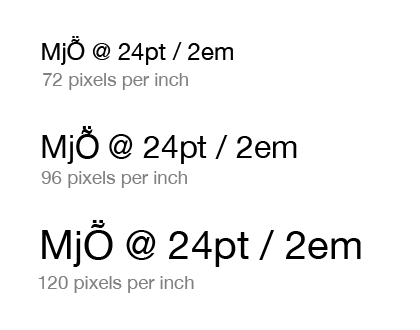
If you’re lucky enough to have a Retina Display on your Mac, you’ll be rendering text at 144 DPI (2 × 72 DPI). That’s 20% larger than the last example above (Windows’ 120 DPI setting.) Display resolution is increasing and so are the number of pixels needed to represent “a point”.

Note that you can’t “fix” this problem by specifying sizes in pixels. If you specify a font size of 16px, your browser will still treat that as 12pt and display it accordingly.

As a designer or developer, you’ll want to make sure that any layout you’re doing for the web takes these size differences into account. Some apps, like Photoshop, allow you to specify the resolution of a document (that’s how I performed my sizing tests.) Make sure it’s set to 96 DPI. Resolution may not matter for exporting images from Photoshop, but it will make a difference in the size of the text in your design comps.

Most other Mac apps will rely on Cocoa’s text system to render text, so if there’s no setting to change the document’s resolution, a default of 72 DPI should be assumed.

An alternative that would suck is to start doing your design and development work on Windows where the default is 96 DPI. That setting also explains why web browsers use this resolution: remember when Internet Explorer had huge market share?

And finally, expect some exciting new features for measuring, inspecting and testing text in your favorite tool for design and development. I’m doing all this precise measurement for a reason :-)

Updated February 25, 2014: It turns out Todd Fahrner first identified this problem back in the late 1990′s. His work with the W3C was instrumental in standardizing on 96 DPI. What’s depressing is that I knew about this work: Jeffrey Zeldman and I even developed the Photoshop filters mentioned on his site. Maybe I should send in my AARP membership form now.

Read the whole story
rwarner
3694 days ago
reply
Displaying text on the screen should be simpler.
iPhone: 30.163819,-81.571257
Share this story
Delete

Nieces sometimes extrapolate from insufficient contextual data

1 Comment

My brother-in-law enjoys greeting his nieces when they come over to visit by throwing them into the air and asking, "叫聲我?" (Who am I?)

The nieces happily reply, "舅舅." (Uncle.)

He then tosses them up into the air a second time and says, "大聲啲!" (Louder!)

And the nieces happily shout, "舅舅!"

One time, my wife was talking with her brother at a normal volume, and his niece came into the room and said to my wife, "大聲啲! 舅舅聽唔到!" 舅舅冇聽到!" (Louder! Uncle can't hear you!)

Update: Per Frank's suggestion below, changed the niece's outburst from "舅舅冇聽到!" The incident occurred many years ago, and I cannot remember exactly what was said, so I'll go with what's funnier.

Read the whole story
rwarner
3698 days ago
reply
Children say the darnedest things!
iPhone: 30.163819,-81.571257
Share this story
Delete
Next Page of Stories